自定义底部标签栏
本指南涵盖了在 createBottomTabNavigator 中自定义标签栏。请确保首先按照安装说明安装和配置库。
为每个标签添加图标
这类似于您自定义堆栈导航器的方式 — 有些属性在您初始化标签导航器时设置,而另一些属性可以在每个屏幕的 options 中自定义。
- 静态
- 动态
// You can import Ionicons from @expo/vector-icons/Ionicons if you use Expo or
// react-native-vector-icons/Ionicons otherwise.
import Ionicons from 'react-native-vector-icons/Ionicons';

const RootTabs = createBottomTabNavigator({
  screenOptions: ({ route }) => ({
    tabBarIcon: ({ focused, color, size }) => {
      let iconName;

      if (route.name === 'Home') {
        iconName = focused
          ? 'ios-information-circle'
          : 'ios-information-circle-outline';
      } else if (route.name === 'Settings') {
        iconName = focused ? 'ios-list' : 'ios-list-outline';
      }

      // You can return any component that you like here!
      return <Ionicons name={iconName} size={size} color={color} />;
    },
    tabBarActiveTintColor: 'tomato',
    tabBarInactiveTintColor: 'gray',
  }),
  screens: {
    Home: HomeScreen,
    Settings: SettingsScreen,
  },
});
// You can import Ionicons from @expo/vector-icons/Ionicons if you use Expo or
// react-native-vector-icons/Ionicons otherwise.
import Ionicons from 'react-native-vector-icons/Ionicons';

function RootTabs() {
  return (
    <Tab.Navigator
      screenOptions={({ route }) => ({
        tabBarIcon: ({ focused, color, size }) => {
          let iconName;

          if (route.name === 'Home') {
            iconName = focused
              ? 'ios-information-circle'
              : 'ios-information-circle-outline';
          } else if (route.name === 'Settings') {
            iconName = focused ? 'ios-list' : 'ios-list-outline';
          }

          // You can return any component that you like here!
          return <Ionicons name={iconName} size={size} color={color} />;
        },
        tabBarActiveTintColor: 'tomato',
        tabBarInactiveTintColor: 'gray',
      })}
    >
      <Tab.Screen name="Home" component={HomeScreen} />
      <Tab.Screen name="Settings" component={SettingsScreen} />
    </Tab.Navigator>
  );
}
让我们分析一下
tabBarIcon是底部标签导航器中受支持的选项。所以我们知道可以在屏幕组件的options属性中使用它,但在本例中,我们选择将其放在Tab.Navigator的screenOptions属性中,以便集中图标配置,方便使用。tabBarIcon是一个函数,它被赋予focused状态、color和size参数。如果您进一步查看配置,您将看到tabBarActiveTintColor和tabBarInactiveTintColor。这些默认为 iOS 平台默认值,但您可以在此处更改它们。传递给tabBarIcon的color是活动或非活动颜色,具体取决于focused状态(focused 是活动状态)。size是标签栏期望的图标大小。- 阅读完整的 API 参考,以获取有关
createBottomTabNavigator配置选项的更多信息。
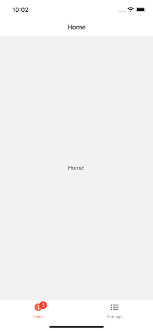
为图标添加徽章
有时我们想为某些图标添加徽章。您可以使用 tabBarBadge 选项 来做到这一点
- 静态
- 动态
const RootTabs = createBottomTabNavigator({
  screens: {
    Home: {
      screen: HomeScreen,
      options: {
        tabBarBadge: 3,
      },
    },
    Settings: SettingsScreen,
  },
});
function RootTabs() {
  return (
    <Tab.Navigator>
      <Tab.Screen
        name="Home"
        component={HomeScreen}
        options={{
          tabBarBadge: 3,
        }}
      />
      <Tab.Screen name="Settings" component={SettingsScreen} />
    </Tab.Navigator>
  );
}
从 UI 角度来看,此组件已准备好使用,但您仍然需要找到某种方法从其他地方正确传递徽章计数,例如使用 React Context、Redux、MobX 或 事件发射器。
您还可以通过使用 setOptions 方法从屏幕组件内部更新徽章
const navigation = useNavigation();

React.useEffect(() => {
  navigation.setOptions({
    tabBarBadge: unreadMessagesCount,
  });
}, [navigation, unreadMessagesCount]);