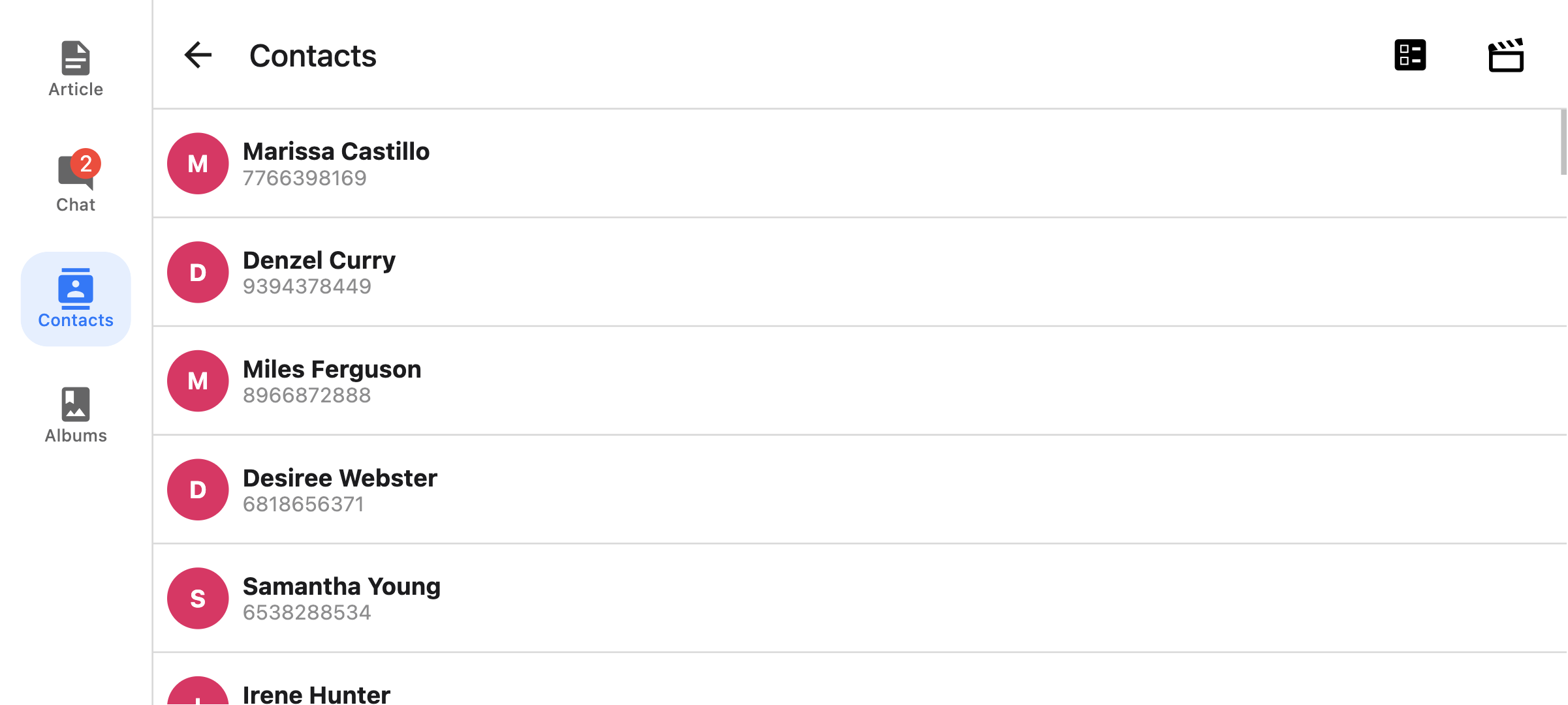
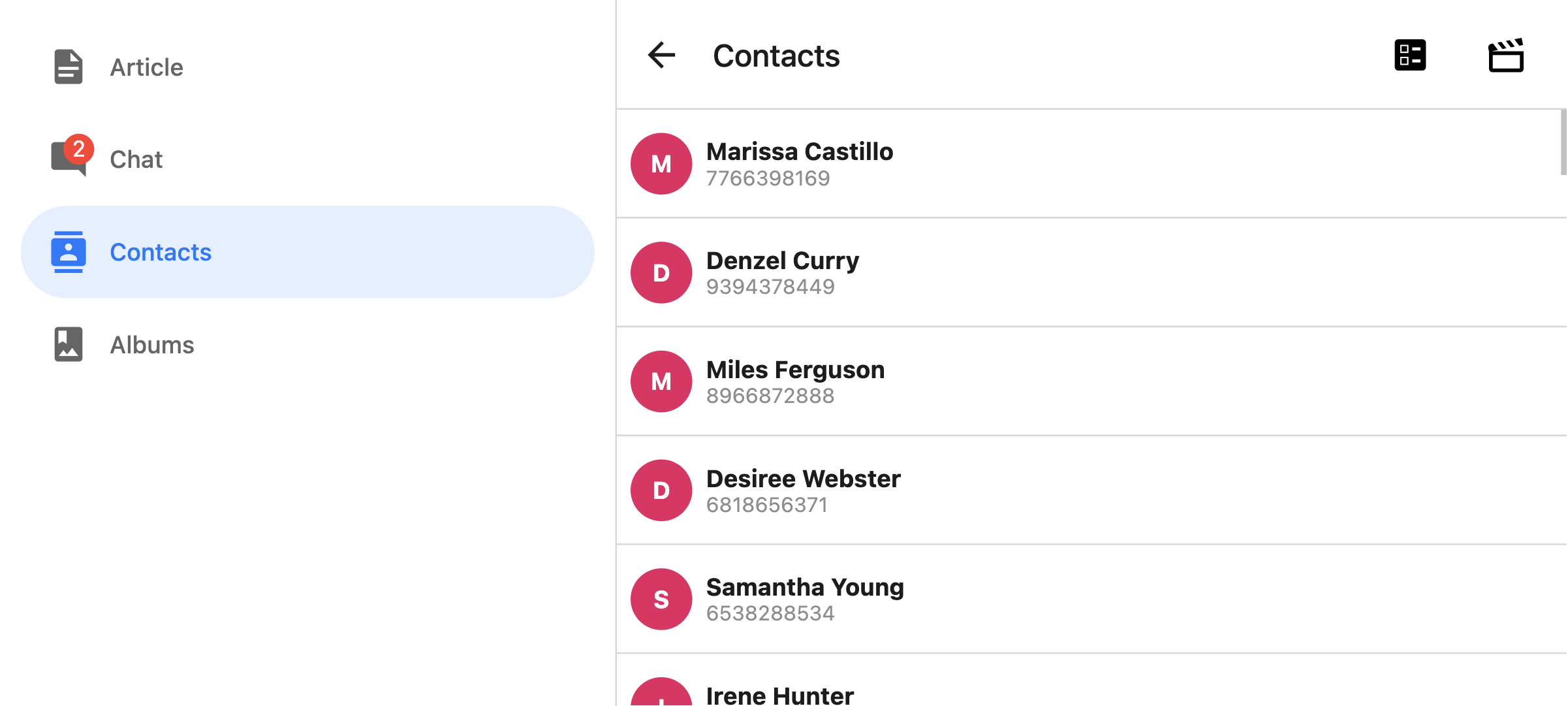
底部标签导航器
屏幕底部的简单标签栏,可让您在不同路由之间切换。路由是延迟初始化的 -- 它们的屏幕组件在首次聚焦之前不会被挂载。
安装
要使用此导航器,请确保您已安装 @react-navigation/native 及其依赖项(请按照本指南),然后安装 @react-navigation/bottom-tabs
- npm
- Yarn
- pnpm
npm install @react-navigation/bottom-tabs
yarn add @react-navigation/bottom-tabs
pnpm add @react-navigation/bottom-tabs
用法
要使用此导航器,请从 @react-navigation/bottom-tabs 导入它
- 静态
- 动态
import { createBottomTabNavigator } from '@react-navigation/bottom-tabs';

const MyTabs = createBottomTabNavigator({
  screens: {
    Home: HomeScreen,
    Profile: ProfileScreen,
  },
});
import { createBottomTabNavigator } from '@react-navigation/bottom-tabs';

const Tab = createBottomTabNavigator();

function MyTabs() {
  return (
    <Tab.Navigator>
      <Tab.Screen name="Home" component={HomeScreen} />
      <Tab.Screen name="Profile" component={ProfileScreen} />
    </Tab.Navigator>
  );
}
API 定义
属性
除了所有导航器共享的通用属性外,底部标签导航器还接受以下附加属性
backBehavior
这控制了在导航器中调用 goBack 时会发生什么。 这包括按下设备的后退按钮或 Android 上的后退手势。
它支持以下值
firstRoute- 返回到导航器中定义的第一个屏幕(默认)initialRoute- 返回到在initialRouteName属性中传递的初始屏幕;如果未传递,则默认为第一个屏幕。order- 返回到聚焦屏幕之前定义的屏幕history- 返回到导航器中上次访问的屏幕;如果同一屏幕被多次访问,则较旧的条目将从历史记录中删除。none- 不处理后退按钮
detachInactiveScreens
布尔值,用于指示是否应将非活动屏幕从视图层次结构中分离出来以节省内存。这实现了与 react-native-screens 的集成。默认为 true。
tabBar
返回一个 React 元素以显示为标签栏的函数。
该函数接收一个对象作为参数,其中包含以下属性:
state- 标签导航器的状态对象。descriptors- 描述符对象,其中包含标签导航器的选项。navigation- 标签导航器的导航对象。
state.routes 数组包含导航器中定义的所有路由。可以使用 descriptors[route.key].options 访问每个路由的选项。
示例
- 静态
- 动态
import { View, Platform } from 'react-native';
import { useLinkBuilder, useTheme } from '@react-navigation/native';
import { Text, PlatformPressable } from '@react-navigation/elements';
import { createBottomTabNavigator } from '@react-navigation/bottom-tabs';

function MyTabBar({ state, descriptors, navigation }) {
  const { colors } = useTheme();
  const { buildHref } = useLinkBuilder();

  return (
    <View style={{ flexDirection: 'row' }}>
      {state.routes.map((route, index) => {
        const { options } = descriptors[route.key];
        const label =
          options.tabBarLabel !== undefined
            ? options.tabBarLabel
            : options.title !== undefined
              ? options.title
              : route.name;

        const isFocused = state.index === index;

        const onPress = () => {
          const event = navigation.emit({
            type: 'tabPress',
            target: route.key,
            canPreventDefault: true,
          });

          if (!isFocused && !event.defaultPrevented) {
            navigation.navigate(route.name, route.params);
          }
        };

        const onLongPress = () => {
          navigation.emit({
            type: 'tabLongPress',
            target: route.key,
          });
        };

        return (
          <PlatformPressable
            href={buildHref(route.name, route.params)}
            accessibilityState={isFocused ? { selected: true } : {}}
            accessibilityLabel={options.tabBarAccessibilityLabel}
            testID={options.tabBarButtonTestID}
            onPress={onPress}
            onLongPress={onLongPress}
            style={{ flex: 1 }}
          >
            <Text style={{ color: isFocused ? colors.primary : colors.text }}>
              {label}
            </Text>
          </PlatformPressable>
        );
      })}
    </View>
  );
}

const MyTabs = createBottomTabNavigator({
  tabBar: (props) => <MyTabBar {...props} />,
  screens: {
    Home: HomeScreen,
    Profile: ProfileScreen,
  },
});
import { View, Platform } from 'react-native';
import { useLinkBuilder, useTheme } from '@react-navigation/native';
import { Text, PlatformPressable } from '@react-navigation/elements';
import { createBottomTabNavigator } from '@react-navigation/bottom-tabs';

function MyTabBar({ state, descriptors, navigation }) {
  const { colors } = useTheme();
  const { buildHref } = useLinkBuilder();

  return (
    <View style={{ flexDirection: 'row' }}>
      {state.routes.map((route, index) => {
        const { options } = descriptors[route.key];
        const label =
          options.tabBarLabel !== undefined
            ? options.tabBarLabel
            : options.title !== undefined
              ? options.title
              : route.name;

        const isFocused = state.index === index;

        const onPress = () => {
          const event = navigation.emit({
            type: 'tabPress',
            target: route.key,
            canPreventDefault: true,
          });

          if (!isFocused && !event.defaultPrevented) {
            navigation.navigate(route.name, route.params);
          }
        };

        const onLongPress = () => {
          navigation.emit({
            type: 'tabLongPress',
            target: route.key,
          });
        };

        return (
          <PlatformPressable
            href={buildHref(route.name, route.params)}
            accessibilityState={isFocused ? { selected: true } : {}}
            accessibilityLabel={options.tabBarAccessibilityLabel}
            testID={options.tabBarButtonTestID}
            onPress={onPress}
            onLongPress={onLongPress}
            style={{ flex: 1 }}
          >
            <Text style={{ color: isFocused ? colors.primary : colors.text }}>
              {label}
            </Text>
          </PlatformPressable>
        );
      })}
    </View>
  );
}

function MyTabs() {
  return (
    <Tab.Navigator
      tabBar={(props) => <MyTabBar {...props} />}
    >
      <Tab.Screen name="Home" component={HomeScreen} />
      <Tab.Screen name="Profile" component={ProfileScreen} />
    </Tab.Navigator>
  );
}
此示例将渲染一个带有标签的基本标签栏。
请注意,您不能在 tabBar 内部使用 useNavigation Hook,因为 useNavigation 仅在屏幕内部可用。 您可以为您的 tabBar 获取一个 navigation 属性,您可以改用它。
function MyTabBar({ navigation }) {
  return (
    <Button
      onPress={() => {
        // Navigate using the `navigation` prop that you received
        navigation.navigate('SomeScreen');
      }}
    >
      Go somewhere
    </Button>
  );
}
选项
以下选项可用于配置导航器中的屏幕。 这些可以在 Tab.navigator 的 screenOptions 属性或 Tab.Screen 的 options 属性下指定。
title
通用标题,可以用作 headerTitle 和 tabBarLabel 的后备。
tabBarLabel
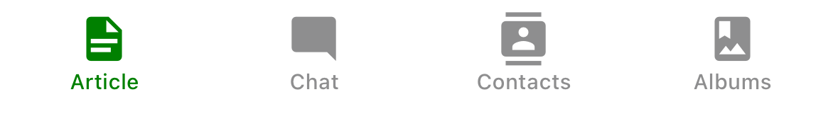
标签栏中显示的选项卡的标题字符串,或给定 { focused: boolean, color: string } 返回 React.Node 以在标签栏中显示的函数。 未定义时,使用场景 title。 要隐藏,请参阅 tabBarShowLabel。
tabBarShowLabel
选项卡标签是否应可见。 默认为 true。
tabBarLabelPosition
标签是显示在图标下方还是图标旁边。
默认情况下,位置会根据设备宽度自动选择。
-
below-icon: 标签显示在图标下方(iPhone 的典型情况)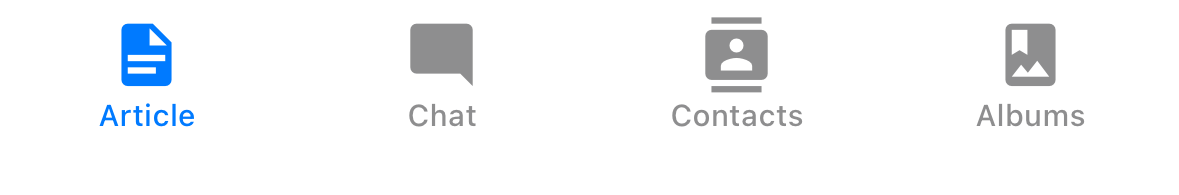
-
beside-icon标签显示在图标旁边(iPad 的典型情况)
tabBarLabelStyle
选项卡标签的样式对象。
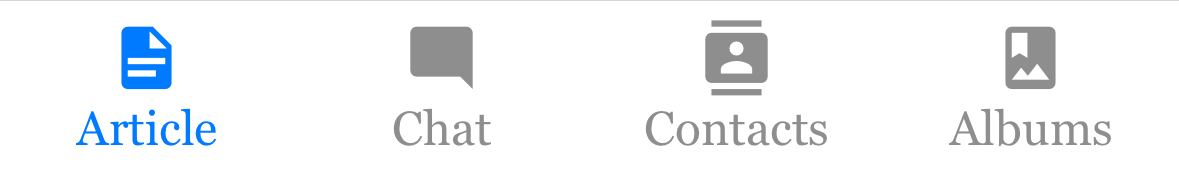
示例
    tabBarLabelStyle: {
      fontSize: 16,
      fontFamily: 'Georgia',
      fontWeight: 300,
    },
tabBarIcon
给定 { focused: boolean, color: string, size: number } 返回 React.Node 以在标签栏中显示的函数。
tabBarIconStyle
选项卡图标的样式对象。
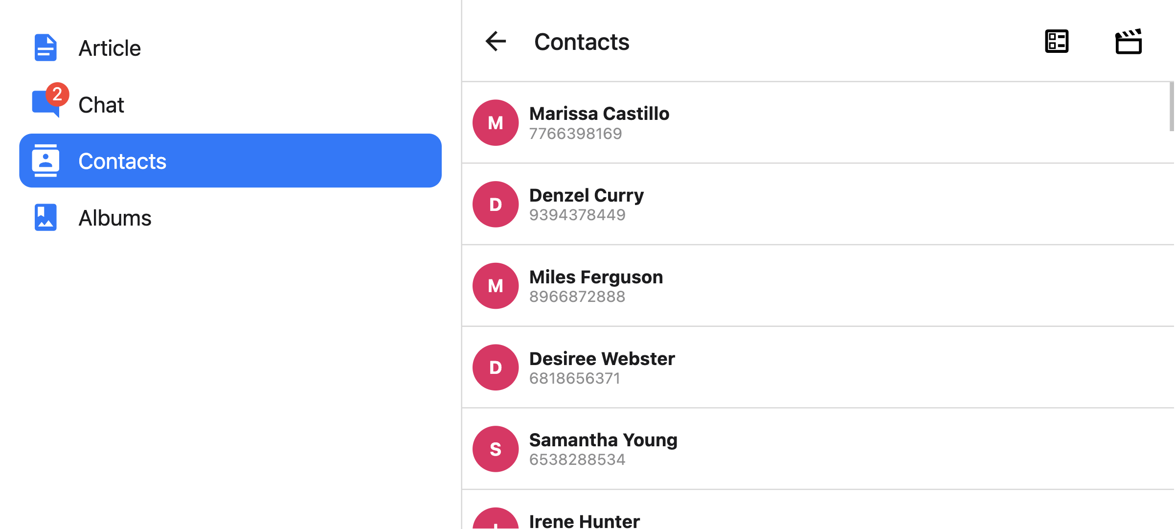
tabBarBadge
要在选项卡图标上的徽章中显示的文本。 接受 string 或 number。
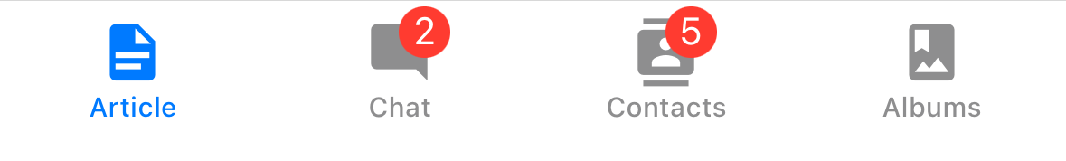
tabBarBadgeStyle
选项卡图标上徽章的样式。 您可以在此处指定背景颜色或文本颜色。
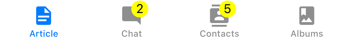
示例
    tabBarBadgeStyle: {
      color: 'black',
      backgroundColor: 'yellow',
    },
tabBarAccessibilityLabel
选项卡按钮的辅助功能标签。 当用户点击选项卡时,屏幕阅读器会读取此标签。 如果您没有选项卡的标签,建议设置此标签。
tabBarButton
返回一个 React 元素以渲染为标签栏按钮的函数。 它包装了图标和标签。 默认情况下渲染 Pressable。
您可以在此处指定自定义实现。
tabBarButton: (props) => <TouchableOpacity {...props} />;
tabBarButtonTestID
在测试中定位此选项卡按钮的 ID。
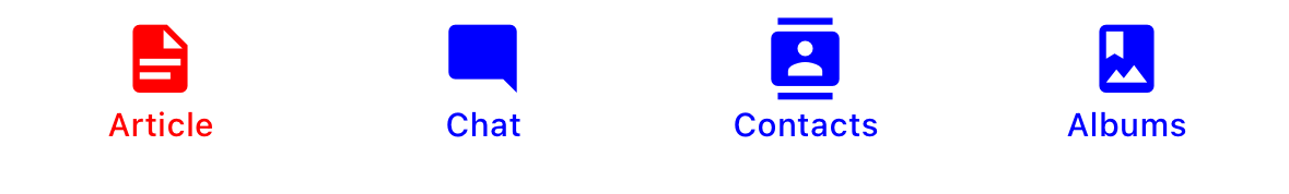
tabBarActiveTintColor
活动选项卡中图标和标签的颜色。
tabBarInactiveTintColor
非活动选项卡中图标和标签的颜色。
tabBarActiveBackgroundColor
活动选项卡的背景颜色。
tabBarInactiveBackgroundColor
非活动选项卡的背景颜色。
tabBarHideOnKeyboard
当键盘打开时,标签栏是否隐藏。 默认为 false。
tabBarItemStyle
选项卡项目容器的样式对象。
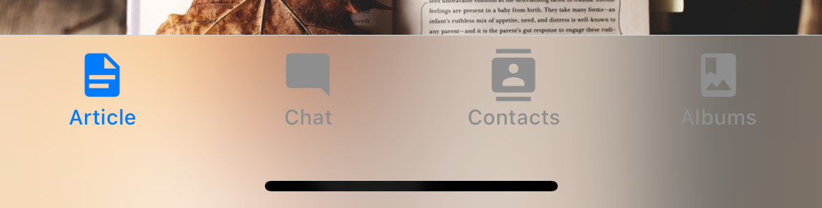
tabBarStyle
标签栏的样式对象。 您可以在此处配置背景颜色等样式。
要在标签栏下方显示您的屏幕,您可以将 position 样式设置为 absolute
<Tab.Navigator
  screenOptions={{
    tabBarStyle: { position: 'absolute' },
  }}
>
如果您有一个绝对定位的标签栏,您可能还需要为您的内容添加底部边距。 React Navigation 不会自动执行此操作。 有关更多详细信息,请参阅 useBottomTabBarHeight。
tabBarBackground
返回一个 React 元素以用作标签栏背景的函数。 您可以渲染图像、渐变、模糊视图等。
import { BlurView } from 'expo-blur';

// ...

<Tab.Navigator
  screenOptions={{
    tabBarStyle: { position: 'absolute' },
    tabBarBackground: () => (
      <BlurView tint="light" intensity={100} style={StyleSheet.absoluteFill} />
    ),
  }}
>
使用 BlurView 时,请确保也在 tabBarStyle 中设置 position: 'absolute'。 您还需要使用 useBottomTabBarHeight 为您的内容添加底部内边距。
tabBarPosition
标签栏的位置。 可用值包括:
bottom(默认)topleftright
当标签栏位于 left 或 right 时,它被样式化为侧边栏。 当您想在较大屏幕上显示侧边栏,在较小屏幕上显示底部标签栏时,这可能很有用。
- 静态
- 动态
const Tabs = createBottomTabNavigator({
  screenOptions: {
    tabBarPosition: isLargeScreen ? 'left' : 'bottom',
  },

  // ...
});
<Tab.Navigator
  screenOptions={{
    tabBarPosition: isLargeScreen ? 'left' ? 'bottom',
  }}
>
您还可以通过将标签放在图标下方来渲染紧凑型侧边栏。 这仅在 tabBarVariant 设置为 material 时才受支持。
- 静态
- 动态
const Tabs = createBottomTabNavigator({
  screenOptions: {
    tabBarPosition: isLargeScreen ? 'left' ? 'bottom',
    tabBarVariant: isLargeScreen ? 'material' : 'uikit',
    tabBarLabelPosition: 'below-icon',
  },

  // ...
});
<Tab.Navigator
  screenOptions={{
    tabBarPosition: dimensions.width < 600 ? 'bottom' : 'left',
    tabBarLabelPosition: 'below-icon',
  }}
>
tabBarVariant
标签栏的变体。 可用值包括:
uikit(默认) - 标签栏将根据 iOS UIKit 指南进行样式设置。material- 标签栏将根据 Material Design 指南进行样式设置。
material 变体目前仅在 tabBarPosition 设置为 left 或 right 时受支持。
lazy
此屏幕是否应仅在首次访问后才渲染。 默认为 true。 如果您想在导航器的初始渲染时渲染屏幕,请将其设置为 false。
freezeOnBlur
布尔值,指示是否阻止非活动屏幕重新渲染。 默认为 false。 当从 react-native-screens 包中的 enableFreeze() 在应用程序顶部运行时,默认为 true。
仅在 iOS 和 Android 上受支持。
popToTopOnBlur
布尔值,指示在离开此选项卡时,是否应将任何嵌套堆栈弹出到堆栈顶部。 默认为 false。
它仅在标签导航器下嵌套堆栈导航器(例如堆栈导航器或原生堆栈导航器)时才有效。
sceneStyle
包装屏幕内容的组件的样式对象。
标题相关选项
您可以在此处找到标题相关选项的列表。 这些选项可以在 Tab.navigator 的 screenOptions 属性或 Tab.Screen 的 options 属性下指定。 您不必直接使用 @react-navigation/elements 来使用这些选项,它们只是在该页面中记录。
除此之外,底部标签还支持以下选项:
header
要使用的自定义标题栏,而不是默认标题栏。
这接受一个返回 React 元素以显示为标题的函数。 该函数接收一个对象作为参数,其中包含以下属性:
navigation- 当前屏幕的导航对象。route- 当前屏幕的路由对象。options- 当前屏幕的选项layout- 屏幕的尺寸,包含height和width属性。
示例
import { getHeaderTitle } from '@react-navigation/elements';

// ..

header: ({ navigation, route, options }) => {
  const title = getHeaderTitle(options, route.name);

  return <MyHeader title={title} style={options.headerStyle} />;
};
要为导航器中所有屏幕设置自定义标题,您可以在导航器的 screenOptions 属性中指定此选项。
在 headerStyle 中指定 height
如果您的自定义标题栏的高度与默认标题栏的高度不同,那么您可能会注意到由于测量是异步的而导致的故障。 显式指定高度将避免此类故障。
示例
headerStyle: {
  height: 80, // Specify the height of your custom header
};
请注意,默认情况下,此样式不应用于标题栏,因为您控制自定义标题栏的样式。 如果您还想将此样式应用于您的标题栏,请使用 props 中的 options.headerStyle。
headerShown
是否显示或隐藏屏幕的标题栏。 默认情况下显示标题栏。 将此设置为 false 将隐藏标题栏。
事件
导航器可以在某些操作上发出事件。 支持的事件包括:
tabPress
当用户在标签栏中按下当前屏幕的选项卡按钮时,会触发此事件。 默认情况下,选项卡按下会执行以下几项操作:
- 如果选项卡未聚焦,则选项卡按下将聚焦该选项卡。
- 如果选项卡已聚焦
- 如果选项卡的屏幕渲染滚动视图,则可以使用
useScrollToTop将其滚动到顶部。 - 如果选项卡的屏幕渲染堆栈导航器,则会在堆栈上执行
popToTop操作。
- 如果选项卡的屏幕渲染滚动视图,则可以使用
要阻止默认行为,您可以调用 event.preventDefault。
React.useEffect(() => {
  const unsubscribe = navigation.addListener('tabPress', (e) => {
    // Prevent default behavior
    e.preventDefault();

    // Do something manually
    // ...
  });

  return unsubscribe;
}, [navigation]);
如果您有自定义标签栏,请确保发出此事件。
tabLongPress
当用户在标签栏中长时间按下当前屏幕的选项卡按钮时,会触发此事件。 如果您有自定义标签栏,请确保发出此事件。
示例
React.useEffect(() => {
  const unsubscribe = navigation.addListener('tabLongPress', (e) => {
    // Do something
  });

  return unsubscribe;
}, [navigation]);
辅助方法
标签导航器将以下方法添加到导航对象:
jumpTo
导航到标签导航器中的现有屏幕。 该方法接受以下参数:
name- 字符串 - 要跳转到的路由的名称。params- 对象 - 用于目标路由的屏幕参数。
navigation.jumpTo('Profile', { owner: 'Michaś' });
Hook
底部标签导航器导出以下 Hook:
useBottomTabBarHeight
此 Hook 返回底部标签栏的高度。 默认情况下,屏幕内容不会位于标签栏下方。 但是,如果您想使标签栏绝对定位并将内容放在其下方(例如,显示模糊效果),则有必要调整内容以考虑标签栏高度。
示例
import { useBottomTabBarHeight } from '@react-navigation/bottom-tabs';

function MyComponent() {
  const tabBarHeight = useBottomTabBarHeight();

  return (
    <ScrollView contentStyle={{ paddingBottom: tabBarHeight }}>
      {/* Content */}
    </ScrollView>
  );
}
或者,如果您正在使用类组件或需要在可在底部标签导航器外部使用的可重用组件中使用它,则可以直接使用 BottomTabBarHeightContext。
import { BottomTabBarHeightContext } from '@react-navigation/bottom-tabs';

// ...

<BottomTabBarHeightContext.Consumer>
  {tabBarHeight => (
    /* render something */
  )}
</BottomTabBarHeightContext.Consumer>
动画
默认情况下,在选项卡之间切换没有任何动画。 您可以指定 animation 选项来自定义过渡动画。
animation 支持的值包括:
-
fade- 屏幕过渡的交叉淡入淡出动画,其中新屏幕淡入,旧屏幕淡出。 -
shift- 屏幕过渡的平移动画,其中屏幕稍微向左/向右移动。 -
none- 屏幕过渡没有任何动画。 这是默认值。
- 静态
- 动态
const RootTabs = createBottomTabNavigator({
  screenOptions: {
    animation: 'fade',
  },
  screens: {
    Home: HomeScreen,
    Profile: ProfileScreen,
  },
});
function RootTabs() {
  return (
    <Tab.Navigator
      screenOptions={{
        animation: 'fade',
      }}
    >
      <Tab.Screen name="Home" component={HomeScreen} />
      <Tab.Screen name="Profile" component={ProfileScreen} />
    </Tab.Navigator>
  );
}
如果您需要对动画进行更多控制,则可以使用各种与动画相关的选项来自定义动画的各个部分。
动画相关选项
底部标签导航器公开了各种选项,用于配置在切换选项卡时的过渡动画。 这些过渡动画可以在每个屏幕的基础上进行自定义,方法是在每个屏幕的 options 中指定选项,或者通过在 screenOptions 中指定它们来为标签导航器中的所有屏幕自定义。
-
transitionSpec- 一个对象,用于指定动画类型(timing或spring)及其选项(例如timing的duration)。 它包含 2 个属性:animation- 用于动画的动画函数。 支持的值为timing和spring。config- timing 函数的配置对象。 对于timing,它可以是duration和easing。 对于spring,它可以是stiffness、damping、mass、overshootClamping、restDisplacementThreshold和restSpeedThreshold。
使用 timing 动画的配置如下所示:
const config = {
  animation: 'timing',
  config: {
    duration: 150,
    easing: Easing.inOut(Easing.ease),
  },
};
我们可以在
transitionSpec选项中传递此配置。- 静态
- 动态
{
  Profile: {
    screen: Profile,
    options: {
      transitionSpec: {
        animation: 'timing',
        config: {
          duration: 150,
          easing: Easing.inOut(Easing.ease),
        },
      },
    },
  },
}<Tab.Screen
name="Profile"
component={Profile}
options={{
transitionSpec: {
animation: 'timing',
config: {
duration: 150,
easing: Easing.inOut(Easing.ease),
},
},
}}
/> -
sceneStyleInterpolator- 这是一个函数,用于指定场景各个部分的插值样式。 它当前支持包含屏幕的视图的样式:sceneStyle- 包装屏幕内容的容器视图的样式。
该函数在其参数中接收以下属性:
current- 当前屏幕的动画值progress- 表示当前屏幕进度值的动画节点。
淡化屏幕的配置如下所示:
const forFade = ({ current }) => ({
  sceneStyle: {
    opacity: current.progress.interpolate({
      inputRange: [-1, 0, 1],
      outputRange: [0, 1, 0],
    }),
  },
});current.progress的值如下:- -1 如果索引低于活动选项卡,
- 0 如果它们处于活动状态,
- 1 如果索引高于活动选项卡
我们可以在
sceneStyleInterpolator选项中传递此函数。- 静态
- 动态
{
  Profile: {
    screen: Profile,
    options: {
      sceneStyleInterpolator: ({ current }) => ({
        sceneStyle: {
          opacity: current.progress.interpolate({
            inputRange: [-1, 0, 1],
            outputRange: [0, 1, 0],
          }),
        },
      }),
    },
  },
}<Tab.Screen
name="Profile"
component={Profile}
options={{
sceneStyleInterpolator: ({ current }) => ({
sceneStyle: {
opacity: current.progress.interpolate({
inputRange: [-1, 0, 1],
outputRange: [0, 1, 0],
}),
},
}),
}}
/>
将这些放在一起,您可以自定义屏幕的过渡动画。
- 静态
- 动态
const RootTabs = createBottomTabNavigator({
  screenOptions: {
    transitionSpec: {
      animation: 'timing',
      config: {
        duration: 150,
        easing: Easing.inOut(Easing.ease),
      },
    },
    sceneStyleInterpolator: ({ current }) => ({
      sceneStyle: {
        opacity: current.progress.interpolate({
          inputRange: [-1, 0, 1],
          outputRange: [0, 1, 0],
        }),
      },
    }),
  },
  screens: {
    Home: HomeScreen,
    Profile: ProfileScreen,
  },
});
function RootTabs() {
  return (
    <Tab.Navigator
      screenOptions={{
        transitionSpec: {
          animation: 'timing',
          config: {
            duration: 150,
            easing: Easing.inOut(Easing.ease),
          },
        },
        sceneStyleInterpolator: ({ current }) => ({
          sceneStyle: {
            opacity: current.progress.interpolate({
              inputRange: [-1, 0, 1],
              outputRange: [0, 1, 0],
            }),
          },
        }),
      }}
    >
      <Tab.Screen name="Home" component={HomeScreen} />
      <Tab.Screen name="Profile" component={ProfileScreen} />
    </Tab.Navigator>
  );
}
预制配置
我们还从库中导出各种带有预制配置的配置,您可以使用这些配置来自定义动画。
TransitionSpecs
FadeSpec- 屏幕之间交叉淡入淡出动画的配置。ShiftSpec- 屏幕之间平移动画的配置。
示例
- 静态
- 动态
import { TransitionSpecs } from '@react-navigation/bottom-tabs';

// ...

{
  Profile: {
    screen: Profile,
    options: {
      transitionSpec: TransitionSpecs.CrossFadeSpec,
    },
  },
}
import { TransitionSpecs } from '@react-navigation/bottom-tabs';

// ...

<Tab.Screen
  name="Profile"
  component={Profile}
  options={{
    transitionSpec: TransitionSpecs.FadeSpec,
  }}
/>;
SceneStyleInterpolators
forFade- 屏幕过渡的交叉淡入淡出动画,其中新屏幕淡入,旧屏幕淡出。forShift- 屏幕过渡的平移动画,其中屏幕稍微向左/向右移动。
示例
- 静态
- 动态
import { SceneStyleInterpolators } from '@react-navigation/bottom-tabs';

// ...

{
  Profile: {
    screen: Profile,
    options: {
      sceneStyleInterpolator: SceneStyleInterpolators.forFade,
    },
  },
}
import { SceneStyleInterpolators } from '@react-navigation/bottom-tabs';

// ...

<Tab.Screen
  name="Profile"
  component={Profile}
  options={{
    sceneStyleInterpolator: SceneStyleInterpolators.forFade,
  }}
/>;
TransitionPresets
我们导出过渡预设,这些预设将这些选项的各种集合捆绑在一起。 过渡预设是一个对象,其中包含在 TransitionPresets 下导出的几个与动画相关的屏幕选项。 目前,以下预设可用:
FadeTransition- 屏幕过渡的交叉淡入淡出动画,其中新屏幕淡入,旧屏幕淡出。ShiftTransition- 屏幕过渡的平移动画,其中屏幕稍微向左/向右移动。
您可以在 options 中展开这些预设,以自定义屏幕的动画。
示例
- 静态
- 动态
import { TransitionPresets } from '@react-navigation/bottom-tabs';

// ...

{
  Profile: {
    screen: Profile,
    options: {
      ...TransitionPresets.FadeTransition,
    },
  },
}
import { TransitionPresets } from '@react-navigation/bottom-tabs';

// ...

<Tab.Screen
  name="Profile"
  component={Profile}
  options={{
    ...TransitionPresets.FadeTransition,
  }}
/>;